Monday, June 13, 2011

Copyright Issues

Stock Images

"Stock photography is the supply of photographs licensed for specific uses. It is used to fulfill the needs of creative assignments instead of hiring a photographer. Today, stock images can be presented in searchable online databases. They can be purchased and delivered online." Quoted from Wikipedia


 The following three images would be suitable to use for branding with the 'Thunder Blood' logo;
A pair of MMA fingerless gloves
An MMA fighter in shorts (and gloves)
Team tour bus


These images can be bought from shutterstock.com. They offer both one-off and subscription based options for purchasing their stock imagery (as seen below). 
In this case, the three images for the team logo could be bought with two more images for $50.
This purchase would be made online with a credit card and the photo files would be downloaded for use.

Terms & Conditions;
"2.
By this Agreement, Shutterstock grants you a personal, non-exclusive, non-transferable, right to use and reproduce Images in the following ways, subject to the limitations set forth herein and in Part II hereof:
a)
On web sites, provided that no Image is displayed at a resolution greater than 800 x 600 pixels;
b)
As toolbar skins, screensavers and mobile phone "wallpaper" for your own personal, non-commercial use, not for resale, download or distribution;
c)
As prints, posters (i.e. a hardcopy) and other reproductions for your own personal, non-commercial use and display, not for resale, download or distribution;
d)
As a single hand painted reproduction (not as a printed reproduction) on canvas or other material to be used as decoration and not resold;
e)
In coordination with opt-in email marketing. However, Images cannot be used in connection with unsolicited email - or linked from unsolicited email and no Image may be reproduced or used more than 250,000 times;
f)
On letterhead and business cards, pamphlets, brochures, catalogs and on pop up and/or panel displays for use in conventions and trade shows, provided that no individual Image is reproduced more than 250,000 times in the aggregate;
g)
In the artwork for the packaging of any product provided that the print and/ or manufacturing run does not exceed two hundred fifty thousand (250,000) copies in the aggregate;
h)
Incorporated into software as a background image or splash screen, provided that the Image or any digital files containing the Image cannot be unincorporated from the software and further provided that the manufacturing or duplication run(s)of such software (including downloads of such software) does not exceed two hundred fifty thousand (250,000) copies in the aggregate;
i)
In multimedia presentations and incorporated into film and video for television and/or internet broadcast, and theatrical display only where the intended audience will consist of fewer than two hundred fifty thousand (250,000) viewers;
j)
In multimedia presentations and incorporated into film and video for distribution and/or sale in the home video market, provided that the manufacturing or duplication run (including downloads) of such home videos does not exceed two hundred fifty thousand (250,000) copies in the aggregate;
k)
As CD or DVD cover art and/or artwork, provided that the manufacturing or print run of such CDs or DVDs (including downloads of such artwork) does not exceed two hundred fifty thousand (250,000) copies in the aggregate;
l)
As part of editorial or advertising copy in magazines, newspapers, books, book covers, textbooks, editorials and directories provided that the print or manufacturing run(s) of such magazines, newspapers, books , book covers, textbooks, editorials and directories does not exceed two hundred fifty thousand (250,000) copies in the aggregate;
m)
In eBooks, including multi seat license electronic textbooks, provided that the number of potential seat licenses or end users is fewer than two hundred fifty thousand (250,000) in the aggregate; and
n)
As advertising posters for use in promoting the sale of other products (as opposed to promoting the sale of the prints, posters, etc. containing the Images), provided that such prints and/or posters and/or other reproductions combine words and an Image or Images and further provided that the print or manufacturing run(s) of such posters does not exceed two hundred fifty thousand (250,000) copies in the aggregate."

www.shutterstock.com
http://www.shutterstock.com/licensing.mhtml

Fonts


"FSI FontShop International and its FontFont label was founded by Neville Brody andErik Spiekermann in 1990 in Berlin and is now one of the largest manufacturers of digital typefaces in the world."
Fonts can be purchased from FontFont either individually or as a collection. They are paid for online with credit cards etc and downloaded to the buyers computer.


My Team Logo

 My first design is a direct connection between the figures of Greek mythology and present day cage fighters (Mixed Martial Art). The idea of mixed martial arts as the 'ultimate' combat sport and the high level of fitness and technique these athletes achieve, is a reflection of the 'warrior' status and represents power and strength. This is where the comparison between these athletes of brutality and ancients gods is made. The logo is a strong man resembling the imagery associated with ancient greek gods, modernises by the vector style and MMA gear.
 The second concept is based around one of the most used weapons/strikes in MMA-The fist/Punch. This design is strongly vector based as well, The heavy use of outline and the detail in the bulging veins, and shock waves makes this design busy and overall un-succesful. 
This concept has focused again on the fist, this time grasping a thunderbolt. This imagery of the thunder is a link to the Mythology based around the Greek God Zeus. The open-finger gloves also helps to put the logo in context and make it more recognisable as an MMA logo. The dripping blood on the thunderbolt is also heavily suggestive towards violence and aims to capture some of the reality of the sport.

Monday, May 9, 2011

AGIDEAS

Trends and Designers


Interactivity; 
A trend I noticed at the conference was the crossover between media, culture, and communications. The presentation of content  being connected through the use of technology as well as material work. For example merging print and web, or interactive media in a physical form such as Natan Linder's 'GetLost' compass & Interactive lamp projection. This trend in design is creating a more tangible experience and connecting a broad range of information and techniques. 
Claudio Kirac's work showed another form of this 'Interactivity'. There was a strong exchange and cross-over between creative fields in his work . This broad range of styles and medium is a noticeable step away from specialty in arts or information skills. As access to information increases there is a renaissance mindset re-ermerging that is visible in Claudio's work. This crossing between fields of art and design is in response to creative Directors collaborating between fields e.g lighting, web, print, photography, art, & design.


Simplicity;
There was a re-occuring theme of minimal design and the use of space, shape, and colour. There was an exploration of this in Ken Miki's theory of "Complicated simplicity" and the clean style of his work. Pieces such as his cubed Earth business card and 'snow' art are reflections of this. Though this is a current trend Miki's work has been applying these principles since the 80-90's. A more modern interpretation of this can be seen in Christopher Doyle's work such as the AGDA calendar and for 'The Jezabels' album artwork.


http://www.agideas.net/index.php?nodeId=82&speakerId=73
http://www.agideas.net/index.php?nodeId=82&speakerId=82
http://www.agideas.net/index.php?nodeId=82&speakerId=74
http://www.agideas.net/index.php?nodeId=82&speakerId=60


Concept Evaluation


Stephen Dupont's photographic/print work for the 'Raskols' series was one of the most conceptually refined artwork I observed at AGIDEAS. The idea and the impression it left was extremely thorough in it's detail and presentation. The consistency across the photographic style, the presentation of the gallery, and the final publication created a distinguishing character to that body of work. The use of metals and etchings in the final work did alot to convey the subject matter and reinforce the concept.
The dark moody lighting creates a threatening vibe and portrays the danger of his subject matter. The single subject portraits also reflect the sense of identity and strength held by those in frame.
As a whole, Raskols was a highly finished and hugely conceptual work. The simplicity of his work lies in the pure documentation of a specific culture. The idea of the crime, brutality, violence, and poverty of the situation in Papua New Guinea (where these gangs come from) is expressed with a sense of truth and reality through this series.


http://www.contactpressimages.com/exhibitions/raskols/Raskols.pdf


Saturday, April 16, 2011

Culture in Design


Culture in Design
(talking stick article response)


Aboriginal Motifs


Functions and Philosophies
It is important to understand and reflect the diversity of Aboriginal culture and the perspective of this relationship in both a spiritual and geographical sense. This is strengthened by the role the design will play as material for an Aboriginal community-based footy team, and the association to allegiance, support, and belief.
The first and main principle relates to the connection of this culture and the outlook it holds toward ‘Country’.
“Country in Aboriginal English is not only a common noun but also a proper noun. People talk about country in the same way that they would talk about a person: they speak to country, sing to country, visit country, worry about country, feel sorry for country, and long for country. People say that country knows, hears, smells, takes notice, takes care, is sorry or happy. Country is not a generalised or undifferentiated type of place, such as one might indicate with terms like ‘spending a day in the country’ or ‘going up the country’. Rather, country is a living entity with a yesterday, today and tomorrow, with a consciousness, and a will toward life. Because of this richness, country is home, and peace; nourishment for body, mind, and spirit.”
This strong bond between individual and homeland must be acknowledged and respected when creating a visual identity for an indigenous team. In saying this it is also important to understand specific differences in tribal culture and the diversity of these backgrounds. These are principals that should be understood and reflected in the choice of medium and subject matter while still maintaining the integrity of the culture/community in a modern context.
As the aim of a ‘community-based’ footy team is to bring people together and reflect a common heritage, I would aim to represent this in the design of the logo, uniform, etc. To create a representation of the diversity within a common cultural group while still encompassing the ideals toward the whole spiritual and ancestral motifs of indigenous culture.


Moral rights and Issues
When referencing Aboriginal art and motifs there are moral issues and rights to be aware of to avoid offending those indigenous to the culture. The main concern is using the traditional knowledge or expression of culture in any other form.
This includes;
·      Any use of traditional cultural expression, which does not acknowledge in an appropriate way the community as the source
·        Any distortion, mutilation or other modification of or inappropriate action in relation to the traditional cultural expression
·       Reproduction or publication of the traditional knowledge or expressions of culture
·       Performance or display of the traditional knowledge or expressions of culture in public
·       Make available online or electronically transmit to the public (whether over a path or a combination of paths, or both) traditional knowledge or expression of culture

Any design or artwork referencing or using parts of Aboriginal Culture has an obligation to acknowledge the rights of the original artist and their community/culture. The appropriation and distribution of indigenous artwork should be carefully considered within the context of the design. The use of this artwork should also be relevant as to not offend anyone sensitive to the issue.

http://www.australiacouncil.gov.au/__data/assets/pdf_file/0004/32368/Visual_arts_protocol_guide.pdf

Native American Motifs


The logo for the Washington Redskins NFL team is a simple portrait view of a native American with feathers in his hair. This has evolved from the original logo -a rough, textured tonal version of the image contained in a white circle with yellow stroke- to the modern logo which is a strongly vector based depiction with bold shapes and strong black lines. The yellow stroke of the circle has also become thicker in the modern logo. The facial expression of the character has also become more solemn over time. The logo has had several variations including colour, background, and orientation changes. The concept was also revised on a couple of occasions to a single spear with a feather, and to a ‘R’ circle with feathers.
All logo’s use a variation of the team colours; yellow, red, white, and brown, whether it is shades of these colours or monochromatic.
The concept of the logo relates to tribal customs of Native American culture, and presumably references this in a historical context. The use of Native American motifs in Modern U.S.A –especially sports- culture can be related to general views of native tribes to be fierce warriors or enemies. The appropriation of these symbols to mascot/logo design in many circumstances and has been viewed as offensive and insulting to Native American culture due to the disregard of the symbolic meaning for the members of the society. This may be the reason it has changed to a spear and type-based design in the past, however the choice to change back may be due to tradition and the teams past reputation for racial sensitivity.
Overall the design is successful. It has grown into a strong visual piece over time, and is generally respectful of the culture it has chosen to idealise, especially compared to other, similar designs.

http://en.wikipedia.org/wiki/Washington_Redskins
http://www.dinesh.com/history_of_logos/nfl_logos/washington_redskins_logo_-_design_and_history.html

Monday, April 4, 2011

Trends

  • Woodgrain and/or natural fibre (Texture/Material)
  • Bright High contrast colours
  • Simplicity

Friday, March 25, 2011

Melbourne Sports Museum Critiques


Essendon Bombers Logo

The logo of the Essendon A.F.L team is a flying jet. This is an obvious relationship to the team nickname ‘The Bombers’. It is a triangular shaped depiction of a flying plane with a solid red background and grey outline. The foreground plane figure is also grey with heavy black strokes and dark tonal shapes. A flat use of line and shape create a simple vector based logo that is easily recognized and a distinct representation of the team. The colours used create an aggressive attitude to suggest strength and stability, which is reinforced by the symmetrical and dynamic composition. As a supporter of the team I feel the Bomber logo is a strong symbol of the clubs ideals and focus, and is an appropriate logo for the team.

Rugby logo/Wallabies Jersey

A kangaroo on a rugby ball is the logo for Australian sevens rugby and is adorned on the Wallabies team uniform. The kangaroo is a series of simple flowing organic lines, used to form the shape of the Australian icon. This figure is fit onto a dynamically angled rugby ball; a solid coloured oval with three thick lines on the top. The symbols used are very straightforward and create a strong feeling of Australian identity while reflecting the sport in question.
The shirt is relatively simple too; mainly yellow with green curving shapes on the arms/waist and thin green lines shaped vertically down the torso. Negative space of the kangaroo in the ball is used effectively to smoothly connect the logo to the shirt. Placed on the left breast the logo is figuratively protecting the heart and developing a strong relationship to country, sport, and team. Five stars representing the Southern Cross are also on the bottom of the shirt, again reflecting Australian identity. Green and gold are used on both the logo and the shirt, as these are the iconic Australian sports colours.
Both the logo and the team uniform are designed well to fit contours of the body, and standout while playing. The logo is also a strong visual representation of the dynamics of the sport, the values, and the country of the team. 


Tuesday, March 22, 2011

Critiquing Tools


BASIC ELEMENTS OF DESIGN

Line;is a mark on a surface that describes a shape or outline
Colour;refers to specific hues and has 3 properties, Chroma, Intensity and Value.  The color wheel is a way of showing the chromatic scale in a circle using all the colors made with the primary triad.  Complimentary pairs can produce dull and neutral color.  Black and white can be added to produce tints (add white), shades (add black) and tones (add gray).
Texture;is about surface quality either tactile or visual. Texture can be real or implied by different uses of media. It is the degree of roughness or smoothness in objects.
Shape;is a 2-dimensional line with no form or thickness. Shapes are flat and can be grouped into two categories, geometric and organic.
Form;is a 3-dimensional object having volume and thickness. It is the illusion of a 3-D effect that can be implied with the use of light and shading techniques.  Form can be viewed from many angles.

BASIC PRINCIPLES OF DESIGN

Stability; is what gives a design balance and equilibrium. It distributes visual “weight” throughout space making the design seem fluid rather than lopsided or heavy. The balance of a design can be symmetrical or asymmetrical.
Dynamics;Dynamics is the arrangement of visual elements in a composition to suggest the illusion of movement or direction. The effective use of dynamics in a design can add an emotive characteristic to your design making it appear restful and calming or active and energetic.
Rhythm; is the design principle that bring everything together. By repeating a visual image rhythm imparts a sense of organization that brings a graphic together. This means that everything on the page is visually joined to something else thus giving the work a feeling of wholeness or “oneness”.
Scale; Scale is the size of an object compared to other objects in a piece.


ART VOCABULARY LIST

Proportion; the size of  part of an object compared to the rest of the object.
Negative Space; the space around and between the subject(s) of an image
Mood; the emotional state created by a design
Flowing;  Steady and continuous movement
Jazzy; Showy and/or flashy

ADJECTIVE LIST


Controlled (Line); Restrained and specific 
Chiaroscuro (Colour); The artistic distribution of light and dark masses in a picture
Organic (Shape/Form); Relating to, or derived from living organism e.g. random/sporadic
Geometric (Shape/Form); Composed predominantly of simple geometric forms, such as circles, rectangles, triangles,straight lines etc.
Gooey Texture; Soft and sticky


http://www.princetonol.com/groups/iad/Files/elements2.htm
http://www.adigitaldreamer.com/articles/graphic-design-principles.htm
http://www.swinburne.edu.au/design/tutorials/design/design/
http://www.scribd.com/doc/3224103/Principles-of-Design
http://www.thefreedictionary.com

Monday, February 28, 2011

Art Movements

Impressionism (1863)
The Impressionist movement of painting developed between about 1863 and 1886 by a group of French artists who shared a set of related approaches and techniques. The style is an attempt to reflect the visual reality of a scene or object in terms of momentary impressions of light and colour. This involved the study of movement, and human perception/experience.
The movement faded and transitioned to Post-impressionism by 1886, but its influence on art was both important and ongoing.
The most obvious characteristics include small yet visible brush strokes to simulate actual reflected light. Other characteristics include the use of unmixed primary colors, open composition, ordinary subject matter, and unusual visual angles.
Two principal Impressionist painters were Claude Monet, and Pierre Auguste Renoir.


Surrealism (1920)
Surrealism is an artistic style and cultural movement that was founded in the early 1920s by André Breton. This style uses imagery from the subconscious mind to create art without the intention of logical comprehension. Surrealism developed out of the Dada activities of World War I, primarily in Europe, and was influenced by the psychoanalytical work of Freud and Jung. From the 1920s onward, the movement spread around the globe, eventually affecting the visual arts, literature, film and music of many countries and languages, as well as philosophy, and social theory.
Surrealist works feature the element of surprise, unexpected juxtapositions and non sequitur; however, many Surrealist artists and writers consider their work as an expression of the philosophical movement first and foremost, with the works being an artifact. Leader André Breton was explicit in his claim that Surrealism was principally a revolutionary movement.
René Magritte and Salvador Dali are two predominant surrealist artists.


Magic realism (1920-30)
Magic realism is a visual art (and fictional literary) genre creating an aesthetic style in which magical elements blend to create a realistic atmosphere. It aims to place the "real" and the "fantasy" in the same stream of thought to access a deeper understanding of reality. The painterly style began evolving as early as the first decade of the 20th century but 1925 was when ‘magischer realismus’ and ‘neue sachlichkeit’ were officially recognized as major trends.
The term is a general description with exact definition. Matthew Strecher defines magic realism as "...what happens when a highly detailed, realistic setting is invaded by something too strange to believe."

George Tooker and Jared French are noted artists in this style.


Action painting (1950)
Action painting (sometimes called "gestural abstraction”) was started in the 1950’s by a group of American Abstract Expressionist. It is an extremely direct, instinctual, and dynamic kind of art that involves the spontaneous application of vigorous, sweeping brushstrokes and the chance effects of splashing, smearing, dripping, and spilling paint onto the canvas. The resulting work often emphasizes the physical act of painting itself as an essential aspect of the finished work.

Jackson Pollock and Elaine de Kooning are two major artists in this genre.


Op Art: (1950 - 1965)
The Op art movement involves creating optical illusions and is sometimes called optical art or retinal art. The movement developed from the work of Victor Vasarely, who created tessellations and work with shocking perspectives, and also the Abstract Expressionist movement that discredited the importance of subject matter. The aim of the style is to explore and understand the interaction between illusion and the 2d plane.

Op art works are usually abstract patterns, with many of the better known pieces made in only black and white. The color, line, and shapes are chosen for the purposes of illusion and not to evoke any emotion or mood. Colors and perspective and chosen carefully to achieve the desired effect, and both positive and negative spaces are of equal importance in the composition. When the viewer looks at them, the impression is given of movement, swelling, warping, hidden images, flashing, and vibration.
A major Op Art exhibit in 1965, titled “The Responsive Eye,” caught the public interest. As a result, the style began appearing in print, television, advertising, album art, fashion, and interior decorating. Despite Op Art’s popularity, it never became a mass movement of modern art like Pop Art.

Julian Stanczak and Günther Uecker are two popular optical artists.


Lowbrow (1960-70’s)
Lowbrow is a widespread art movement with origins in punk, hot-rod, and other subcultures. The roots of Lowbrow go back to 1960-70s Southern California hotrod and surf culture. Ed "Big Daddy" Roth is frequently credited with starting Lowbrow, by creating Rat Fink in the late 1950s. Lowbrow art often has a sense of humor - sometimes the humor is gleeful or impish, and sometimes it's has a sarcastic comment.
Most lowbrow artworks are paintings, but there are also toys, digital art, and sculpture and During the 60's branched into underground Comix. Over the years has picked up influences from classic cartoons, 60's TV sitcoms, psychedelic/rock music, pulp art, soft porn, comic books, sci-fi, "B" horror movies, Japanese anime, and many other sub cultures. It is also often known by the name pop surrealism.

Keith Weesner and mike Giant are two modern lowbrow artists.


Lyrical Abstraction (1960-70’s)
Lyrical Abstraction is a relaxed abstract art movement that emerged in the United States, Toronto, and London during the 1960's-1970's. It began with painters who directly reacted against the predominating Formalist, Minimalist, and Pop Art and Geometric Abstraction styles of the sixties, turned to new, experimental, loose, expressive and abstract painting styles.


Lyrical Abstraction moved away from minimalism in painting and toward a new freer creativity. Aiming to expand the boundaries of abstract painting and Minimalism by focusing on new process, materials, and ways of expression. Characterized by intuitive and loose paint handling, spontaneous expression, illusionist space, acrylic staining, occasional imagery, as well as other paint and newer technological techniques.
Emily Mason and Ed Moses are two leading artists of this style.


Photorealism (1960-70’s)
Photorealism is a movement that began in the late 1960's, in which scenes are painted in a style closely resembling photographs. Photographs are used to gather information and then from this information, a realistic painting is created. The subject matter is usually ordinary and without particular interest as the real focus of photorealist work is to accurately reflect a specific interpretation of reality.


The leading members of the Photorealist movement are Richard Estes and Chuck Close. Estes specializes in street scenes with elaborate reflections in window-glass; Close does enormous portraits of usually expressionless faces.


Hyperrealism (2000)
Hyperrealism is an art movement/style developed from Photorealism around the early 2000s. It is based primarily in painting and sculptures and is defined by recreating a high-resolution and/or highly detailed artwork of figures, landscapes, and scenes.
Robert Bechtle and Jacques Bodin are two well-known Hyperrealists.
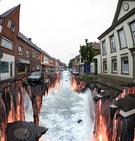


Street art
Contemporary Street art is a recent movement currently developing in public spaces referring to unsanctioned guerrilla art, as opposed to government-sponsored initiatives. The term can include traditional graffiti, stencils, stickers, wheat paste-ups, poster/billboard, written word, video projection, and street installations. Typically, the term street art is used to distinguish public-space artwork from territorial graffiti, vandalism, and corporate art.
This style develops by creating and exposing art in non-art contexts. Street artists do not aspire to change the definition of an artwork, but rather to question the existing environment. They attempt to have their work inspire and communicate with the general public. The motivation of the work can range from socially relevant themes to simple aesthetic appreciation.


Two well known street artists are Banksy and Ghost Patrol.


IMAGES
http://formatmag.com/wp-content/uploads/2007/06/mikegiant_cover.jpg
http://i245.photobucket.com/albums/gg62/witchyhoy3/new3/Untitled-1-115.jpg
http://www.kustomkultureonline.com/uploaded/images/talesflyer.jpg
https://blogger.googleusercontent.com/img/b/R29vZ2xl/AVvXsEgDrTOR2xyRNSagzjGqIBbumHqrvGaev73ftYJCcigUdUvRK8veHqnoZB0uEJHFzR4YXVfF4NVSuSQNHGZUigypAicwqVCf8_pTqmdS1RbfCV02wHagyePmEcohinFxGhZArLEyLPgrh2A/s400/I_OP-ART.jpg
http://tommcnease.tripod.com/sitebuildercontent/sitebuilderpictures/308icon.jpg
http://www.brooklynmuseum.org/images/sized/ron_mueck/Mask_II_m.jpg
http://static.thepioneerwoman.com/homeschooling/files/2009/06/wusdbk.jpg
http://designyoutrust.com/wp-content/uploads6/photorealistic2.jpg
http://upload.wikimedia.org/wikipedia/en/4/4a/No._5%2C_1948.jpg
http://vangogh13.edublogs.org/files/2010/03/action-painting.jpg
https://blogger.googleusercontent.com/img/b/R29vZ2xl/AVvXsEhe8ljn4NrfUGSEUI7PDd5PbT0fhSYgFvmbDIqJpCdD1JESbHQhzzEc9hlEFyt_7mgVGToqepkNiNSHkP3q0JsXOZ8fUJcvTnvmL6gJTQl0l4ZwZfKc4EzTfsOWNcS-C8jstJWxNiwrKd4/s1600/Art+Fantasy+Fantastic+Illusion+Magic+Painting+Surrealism+.jpeg
http://thefiendish.com/wp-content/uploads/2009/02/magic-realism.jpg
http://creoflick.net/images/magic-realism-pictures-2626.jpg
https://blogger.googleusercontent.com/img/b/R29vZ2xl/AVvXsEgzlwfFPpgVc2gr0Ps2hEXSzbthVVc3vDIZIPfQ8L0G4K_E3Z_q7khe5giE4JXPZWNOy4UWXrbp07ZZ_iA6EevMSkU-V0Q31hFWGANGhKvM6_dhMqhBbLLnZR3MsKmSnRUMzT5i6Dcr04qE/s400/surrealism.jpg
http://endicottstudio.typepad.com/endicott_redux/images/2007/09/26/paper_birds_by_steven_kenny.jpg
http://creoflick.net/img/magic-realism-pictures-2629
http://creoflick.net/img/magic-realism-pictures-2628
http://en.wikipedia.org/wiki/File:Claude_Monet,_Impression,_soleil_levant,_1872.jpg
http://en.wikipedia.org/wiki/File:Claude_Monet_The_Cliffs_at_Etretat.jpg
http://www.designundersky.com/storage/blog-images/2009/february/edgar-mullers-3d-street-art/3D-Street-Art-The-3D-stre-003.jpg?__SQUARESPACE_CACHEVERSION=1235541726336
http://cdn0.lostateminor.com/wp-content/uploads/2008/10/berlin-street-art-3.jpg
http://cdn2.lostateminor.com/wp-content/uploads/2008/10/berlin-street-art.jpg
http://en.wikipedia.org/wiki/File:Poster_Art_Fitzroy_1.JPG
http://www.outinperth.com/wp-content/uploads/2008/81/image%20(14).jpg
http://gothamist.com/attachments/jake/2006_8_bburgbanksy1.jpg
http://www.artifice-design.co.uk/banksy2.jpg
http://swindlemagazine.com/images/banksy-2.png
http://cubeme.com/blog/wp-content/uploads/2009/05/mentalgassi_street_art_installations_berlin3.jpg
http://www.globalgraphica.com/wp-content/uploads/2010/02/bunny-spray-paint-can-sticker-tokyo-street-art.jpg

INFO
http://en.wikipedia.org/wiki/Lowbrow_(art_movement)
http://arthistory.about.com/od/arthistory101/a/lowbrow.htm
http://wwar.com/masters/movements/op_art.html
http://en.wikipedia.org/wiki/Op_art
http://www.statemaster.com/encyclopedia/Lyrical-Abstraction
http://en.wikipedia.org/wiki/Hyperrealism_(painting)
http://www.artcyclopedia.com/history/photorealism.html
http://en.wikipedia.org/wiki/Photorealism
http://en.wikipedia.org/wiki/Action_painting
http://www.britannica.com/EBchecked/topic/4477/Action-painting
http://en.wikipedia.org/wiki/Surrealism
http://arthistory.about.com/od/impressionism/Movements_Impressionism.htm
http://www.surrealism.org/
http://en.wikipedia.org/wiki/Magic_realism
http://www.ibiblio.org/wm/paint/glo/impressionism/
http://en.wikipedia.org/wiki/Impressionism
http://en.wikipedia.org/wiki/Street_art
http://en.wikipedia.org/wiki/Street_painting